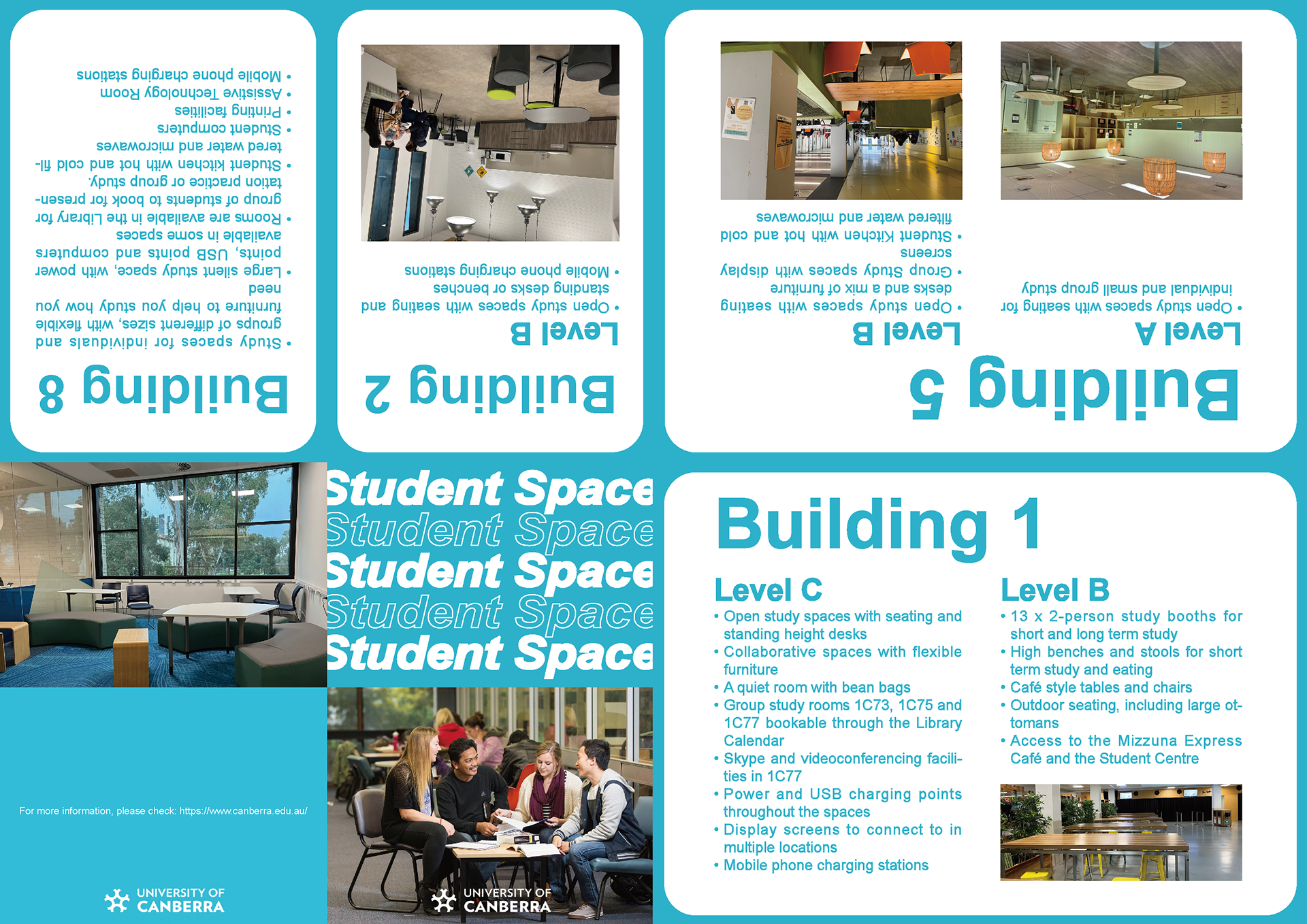
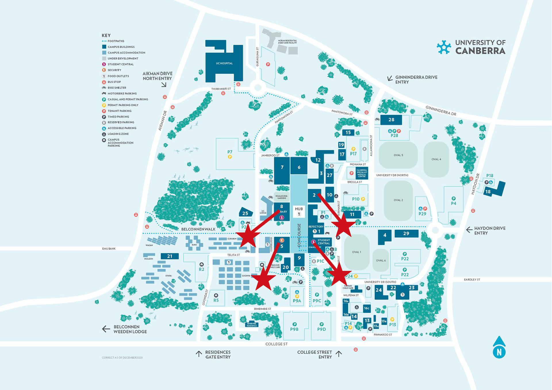

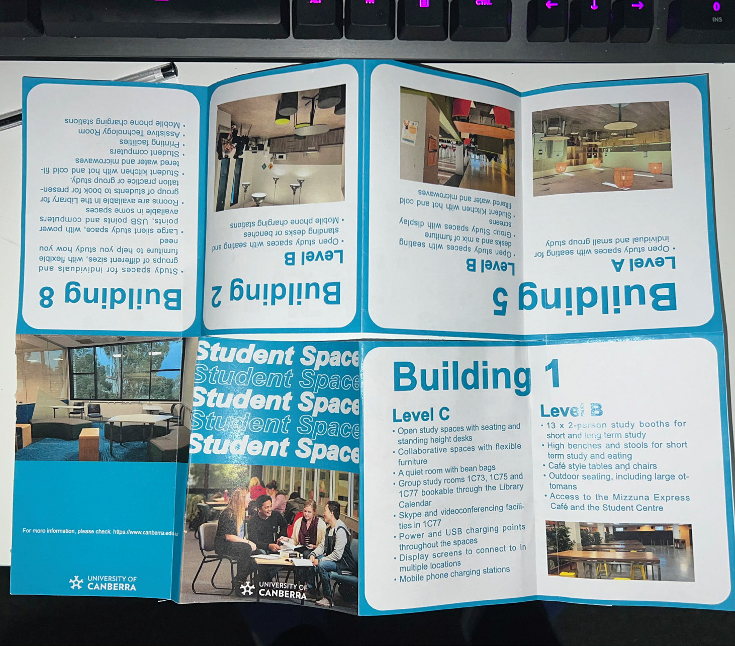

I made my theme choices with the issue of new students not being able to make the most of their study space at university in mind, as they are unaware of the distribution of student space at university and new students may spend a lot of time. time looking for study spaces. To help them, I chose student space as the theme of the magazine. It is an eight-page booklet. In choosing the theme, I considered that new students cannot make full use of the study space in the university because they don't know the distribution of student space in the university and new students may spend a period of time spending a lot of time looking for study space. To help them, I chose student space as the theme of the magazine. For the choice of colours, I chose light blue and white as the theme colours of the magazine. Not only are these two colours the theme colours of the University of Canberra, light blue also represents youthfulness and vitality, and new students will be able to feel the enthusiasm of the university and learn about the facilities in the university when reading my magazine. By combining light blue and white in the text, I have made my typography clearer and more readable. Finally, I completed the booklet by using Adobe InDesign for layout and typesetting.