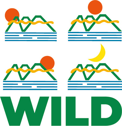

The logo concept for WILD is inspired by the natural beauty of the Canberra region, where the company is based and operates. The green lines in the logo represent the mountain ranges surrounding the region, while the blue horizontal lines represent the waterways that flow through the area. The golden wavy lines in the logo represent the golden clouds that often fill the sky above the region. The logo concept for WILD is inspired by the natural beauty of the Canberra region, where the company is based and operates. The green lines in the logo represent the mountain ranges surrounding the region, while the blue horizontal lines represent the waterways that flow through the area. The golden wavy lines in the logo represent the golden clouds that often fill the sky above the region. The logo concept aligns with the client's mission and objective of providing quality housing and an environment in harmony with nature. The use of natural elements in the logo design reflects the client's commitment to sustainability and eco-friendliness. The combination of green, blue, and gold colors adds to the logo's natural feel, and Montserrat's font choice adds a modern and clean look to the design.
My work for this project began with defining the target market. Once I narrowed down the target market to the high end consumer, I designed the logo and branding to fit this market. The next step was to create an in-depth style guide with all the information required such as the logo, full colour scheme (primary and secondary), typography used, illustrations/icons/patterns (if appropriate) and finally examples of promotional photography that will be used.
My work for this project began with defining the target market. Once I narrowed down the target market to the high end consumer, I designed the logo and branding to fit this market. The next step was to create an in-depth style guide with all the information required such as the logo, full colour scheme (primary and secondary), typography used, illustrations/icons/patterns (if appropriate) and finally examples of promotional photography that will be used.
